Summary:
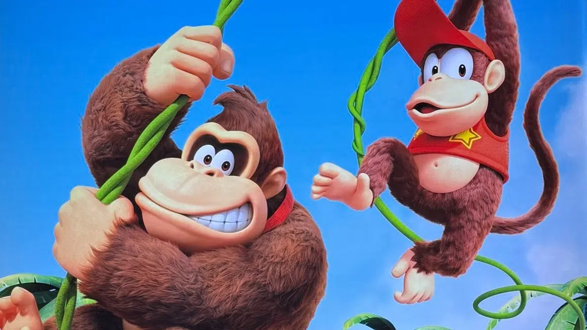
The jungle’s most famous duo just stepped out with eye-catching makeovers. Donkey Kong sports richer fur, brighter eyes, and a reshaped nose that adds personality without ditching his classic charm. Meanwhile, Diddy Kong embraces subtlety: denser fur, a cheeky set of teeth, and—most talked about of all—a baseball cap tilted upward so the beloved Nintendo logo no longer steals the spotlight. These tweaks aren’t random. They reflect Nintendo’s push for expressive characters that pop in cinematic cut-scenes, merchandise, and whatever surprises the Switch 2 has in store. By examining official renders, developer comments, and buzzing fan chatter, we’ll explore how these changes came to be, why they matter, and what they hint at for future DK adventures. Buckle up; there’s plenty to unpack.
Donkey & Diddy: Why the Redesign Matters
When Nintendo quietly updated Donkey Kong’s render earlier this year, seasoned fans felt the shift instantly. The burly ape’s fur now looks plush enough to ruffle, his eyes gleam with softer whites, and that nose? It sits a touch higher, giving him a friendlier profile on splash screens. Cosmetic? Sure—but in an industry where a character’s first frame decides whether players stop scrolling, subtle tweaks turn into major talking points. Diddy Kong followed suit weeks later, proving the company’s commitment to unified visual storytelling across games, films, and merchandise.
A Brief Stroll Through Kong History
Back in 1994, Rare reinvented Donkey Kong for the 16-bit era, trading pixelated barrels for pre-rendered muscles and expressive eyebrows. Over three decades, each hardware leap—from GameCube fur shaders to the Switch’s dynamic lighting—nudged the character closer to the cartoon movie star Nintendo always envisioned. Today’s redesign draws from that lineage, polishing legacy traits rather than rewriting them. It’s evolutionary, not revolutionary, and that incremental philosophy influences every hair strand.
The Fur Factor: Texture Takes Center Stage
Historically, Donkey Kong’s coat looked more like velvet than hair, a limitation of older texture budgets. The new model swaps flat color gradients with layered fur maps, giving individual strands volume that reacts to light and movement. The effect really sings when DK hunches over in animated promos—highlights ripple across his shoulders, tricking the eye into believing there’s real depth. Diddy, although smaller, inherits the same treatment: a shorter, denser fluff that maintains his youthful energy without overshadowing big bro’s silhouette.
Cinematic Inspiration From the Silver Screen
Nintendo’s collaboration with Illumination on The Super Mario Bros. Movie didn’t just bring new fans; it delivered new rendering techniques. Fur simulation pipelines built for the silver screen found their way back to Kyoto, letting in-house artists translate film-quality rigs into real-time assets. Observant viewers will notice DK’s eyebrow rig now supports micro-expressions—a sly nod to Jack Black’s scene-stealing Bowser grimace, repurposed for a gentler giant.
Lighting and Engine Upgrades Behind the Shine
All that fluff would fall flat without proper lighting. Developers migrated to a physically based rendering workflow that bakes ambient occlusion into DK’s creases while allowing stage lights to shimmer off individual hairs. For players, that means every banana-lit jungle scene should feel richer, deeper, and more tactile on modern displays.
Facial Features Reimagined
Beyond fur, the face drives character connection. For Donkey Kong, the art team widened the sclera, softened eye corners, and repositioned pupils just enough to reduce the “angry brow” default seen in earlier games. The nostrils moved upward to sit closer to the eyes—a micro-adjustment that surprisingly humanizes his grin. The nose bridge itself thins out, avoiding the bulky silhouette that sometimes read more “gorilla mask” than “lovable hero.”
Donkey Kong’s Eyes and Nose
The wider whites enlarge DK’s gaze, echoing classic Disney principles: bigger eyes evoke empathy. Comments from art director interviews hint that Shigeru Miyamoto wanted DK to match the broader emotional range showcased in Mario Kart World story scenes. A snub-nose cut amplifies comedic timing too; watch how DK scrunches his face in new bumpers—those nostrils flare just enough to punctuate a punchline.
Diddy’s New Smile and Upturned Cap
Diddy’s makeover is quieter yet no less deliberate. Tiny teeth peek through in fresh renders, lending him a mischievous grin reminiscent of his movie cameo. More controversially, the baseball cap now tilts upward, hiding the once-iconic white Nintendo typeface. In its place, some promos show an enamel DK pin perched on the left side—a clever in-universe homage while sidestepping overt corporate branding. The shift lets artists light Diddy’s eyes more evenly; no brim shadow means brighter, livelier expressions on smaller screens.
Branding and Iconography
Stripping the Nintendo logo surprised long-time fans. Yet it aligns with a wider trend: character-first branding over company logos. DK’s red tie kept its bold yellow initials because they reinforce his identity. For Diddy, the cap has always been his signature. By removing corporate marks, Nintendo signals that the character can stand on his own while still nodding to heritage through color and silhouette.
The Community Reacts
No redesign is complete without social media fireworks. Threads on Reddit, ResetEra, and Famiboards gathered thousands of comments dissecting nostril placement and hat angles. Some fans mourn the lost logo, equating it to Disney erasing Mickey’s buttons. Others celebrate fresh textures, joking that DK finally discovered conditioner. Memes quickly paired “before and after” shots with glow-up captions, proving Nintendo’s ability to spark conversation long before game trailers drop.
Social Media Banter
Hashtags like #FurrierDK and #DiddyCapgate trended briefly, boosted by influencers posting side-by-side GIFs. The general consensus? A thumbs-up to improved fur, mixed feelings about cap branding, and an eagerness to test the models in-game. Crucially, the discourse stayed playful—evidence that Nintendo navigated the treacherous waters of nostalgia with respect.
Meme Culture Swings In
One viral image replaced DK’s new eyes with his classic squint, captioned “Fixed it.” Another pasted the removed Nintendo text onto random hats worn by Toads in Switch Sports 2. By embracing these jokes, the community keeps the Kongs in daily feeds—free marketing in its most organic form.
Implications for Upcoming Games
Expect to see these models front-and-center in Donkey Kong Bananza, rumored for holiday 2025. With more expressive rigs, cut-scenes can lean into cinematic storytelling, while gameplay benefits from clearer silhouette reads during chaotic platforming. The refined fur also scales better across hardware tiers, ensuring handheld users on base Switch models still enjoy crisp visuals.
Merchandise and Marketing Shifts
New plushies already listed on the My Nintendo Store showcase DK’s fluffier chest and Diddy’s hat pin. Collectible figures highlight the duo’s brighter eyes, using glossy paint on ocular details for toy-shelf sparkle. Removing the Nintendo logo means third-party manufacturers avoid extra licensing steps, potentially accelerating product rollout ahead of the next big DK title.
What This Means for Nintendo’s Character Playbook
Nintendo has a reputation for incremental but impactful redesigns—think Mario’s overalls gaining denim stitching or Link’s tunic adopting layered fabrics. The Kongs follow that tradition, suggesting future updates for characters like Dixie or Funky may focus on texture, micro-expression, and brand-neutral accessories. Ultimately, the goal is timeless appeal: keep icons recognizable while leveraging modern tech to deepen player connection.
Conclusion
The latest Donkey Kong and Diddy Kong redesigns might look subtle at first glance, yet every strand of fur and repositioned feature serves a purpose. Nintendo sharpened their silhouettes for clarity, enriched textures for immersion, and fine-tuned facial rigs for broader emotion—all while respecting three decades of legacy. Whether you’re a lifelong fan or a newcomer spotting the duo on a toy shelf, the upgrade invites you to see these primates with fresh eyes and, perhaps, swing back into their adventures with renewed excitement.
FAQs
- Q: Does the redesign affect gameplay mechanics?
- A: No direct mechanics change, but clearer silhouettes and expressions may improve readability during fast-paced levels.
- Q: Why remove the Nintendo logo from Diddy’s cap?
- A: Nintendo appears to favor character-driven iconography over corporate branding, allowing wider storytelling flexibility.
- Q: Will the old designs disappear completely?
- A: Legacy artwork remains on classic re-releases and retro merchandise, but future projects will prioritize the updated models.
- Q: Are other Kong family members getting updates?
- A: Nintendo hasn’t confirmed it, yet industry insiders expect Dixie and Cranky to receive similar texture upgrades soon.
- Q: When will we see the new models in action?
- A: The upcoming platformer Donkey Kong Bananza is the likeliest showcase, rumored for late 2025 on Switch 2.
Sources
- Shigeru Miyamoto Explains Donkey Kong’s New Look, GameSpot, May 21, 2025
- Nintendo Unveils Diddy Kong’s Brand New Design, Nintendo Life, May 15, 2025
- Diddy Kong Gets Revamped, My Nintendo News, May 16, 2025


