


Summary:
Mario Kart World is revving its engines for Nintendo Switch 2, and the newly released 3D packaging views have given fans plenty to scrutinize. From the spine artwork—centered in Europe yet top-aligned in North America—to the multilingual back cover listing, every detail feels like a carefully placed track obstacle hinting at Nintendo’s broader strategy. We’ll explore how these regional differences echo past console eras, why language support on the back panel signals a consumer-friendly pivot, and what all this means for collectors who treasure box art as much as the games inside. Along the way, we’ll consider Nintendo Today’s slick 3D carousel, the fan buzz on social platforms, and the potential ripple effect on future physical releases. Buckle up: you’re about to glide through the sharpest turns and hidden shortcuts of Mario Kart World’s packaging revelation in one smooth ride.
Mario Kart World Packaging: A Sneak Peek at Switch 2’s Physical Future
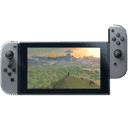
Cracking open the 3D render that surfaced in the Nintendo Today app feels a bit like drifting around Rainbow Road for the first time—bright, surprising, and loaded with subtle cues if you know where to look. The box measures up to its Switch predecessor yet sports marginal tweaks in bezel thickness, suggesting Nintendo is optimising shelf footprint without alienating collectors who love uniform rows of red spines. The iconic red banner still crowns the front, but a slightly deeper hue gives it a premium pop under store lighting, hinting that Nintendo wants boxes to stand out in a world increasingly dominated by digital icons. Curious how a simple shade shift can drive impulse buys? Retail psychologists argue that deeper reds evoke excitement and urgency, nudging players to “grab now, decide later.” With Nintendo chasing both nostalgia and novelty, this packaging sets the pace for how physical media might coexist with eShop convenience on Switch 2.
First look at the Mario Kart World case showing the back, spine art, and front (pieced together from the Nintendo Today app) pic.twitter.com/otdpRH1X4k
— Nintendeal (@Nintendeal) May 10, 2025
American, European, and Japanese Boxes at a Glance
Line the three regional variants side by side and you’ll spot family resemblances as well as bold individual flair—think Mario, Luigi, and Princess Peach rocking matching overalls in different color palettes. The American front cover boasts a bigger ESRB badge, anchoring the lower-left corner like a dependable kart weight. In Europe, PEGI tucks neatly into the lower-right, freeing more visual real estate for the roaring kart lineup sprinting across the artwork. Japan forgoes rating logos altogether on the face, keeping the cover art as pristine as a freshly paved track. These choices aren’t mere cosmetic tweaks; they reflect regulatory demands and cultural preferences. European collectors often praise the symmetry of PEGI placement, while American fans sometimes lament the ESRB’s billboard-like presence. Yet both groups share a secret grin: each version carries exclusive micro-text in the fine print—tiny breadcrumbs that hint at region-locked promotional campaigns to be unveiled closer to launch.
What the 3D View Reveals About Box Dimensions
Spin the virtual case a few degrees, and you’ll notice the clamshell bevel is a hair slimmer than the current Switch design—roughly the width of a gold coin in Mario Party terms. Shaving millimeters may sound trivial, but across millions of units it translates into lighter shipping pallets and tighter retail end-caps. Remember how Nintendo trimmed the DS case thickness midway through that handheld’s life cycle? A similar playbook appears in motion here, suggesting supply-chain efficiency is high on Nintendo’s leaderboard. The inside likely houses a recyclable cardboard insert to keep the game card centered, replacing the plastic nubs that sometimes snap off in transit. Sustainability buffs, rejoice: less plastic means fewer green shells lobbed at the planet. As packaging law tightens across the EU and beyond, Nintendo’s forward-thinking tweaks could help the Big N dodge future fines quicker than a star-powered kart.
Spine Art: Regional Variations and Why They Matter
Turn the case sideways and you’ll witness the quiet battlefield where brand identity, shelf aesthetics, and readability clash like karts in Baby Park. North America retains the upper-aligned title placement, mirroring the OG Switch style. Europe, however, centers the logo, echoing PS5 and Xbox tendencies toward middle-spine harmony. Japan opts for a minimalist kanji-plus-katakana pair toward the top, honoring its long-standing layout. This may seem like trivia—but collectors spend countless hours fussing over uniform spines, and resellers know a misaligned logo can shave euros off resale value faster than a blue shell. Region-specific spine choices also influence import habits: a European fan craving continuity may import the NA version for a flush row, or vice versa. Nintendo’s willingness to tolerate this divergence suggests it values regional personality over global homogeneity, even if that means some fans rearrange their shelves more often than their joy-cons.
Design Language Alignment Between Generations
Look closer and you’ll spot Switch 2’s updated console icon hugging the spine’s apex—sleeker, fresher, and sporting rounded edges that echo modern UI icons. This subtle facelift bridges familiarity with freshness, reassuring existing Switch owners that the new console is kin, not a stranger. Think of it as Mario swapping a classic cap for one with Cappy’s eyes: same hero, upgraded arsenal. By iterating rather than overhauling, Nintendo avoids the Wii U naming confusion that once clouded store aisles, keeping the core silhouette while signalling an evolved ecosystem.
Back Cover Details: Language Support and More
Flip to the back and the American case proudly displays a language lineup broader than the Mushroom Kingdom cast. English, French, Spanish, Portuguese, and more sit in a neat column—an open invitation to multilingual households. This shift marks Nintendo’s recognition of the Americas’ linguistic mosaic, and you can bet future titles will follow suit. Europe’s version lists language icons instead, matching EU box conventions and leaving extra room for gameplay screenshots. Japan keeps text minimal, favoring crisp artwork of Rainbow Cup circuits swirling behind feature blurbs. One tidbit hides in plain sight: the memory requirement icon hints at cartridge capacity, and rumor has it Mario Kart World taps a new high-density card that doubles current Switch storage. If true, that’s a game-changer for developers still battling file-size red shells.
Nintendo’s Shift in Packaging Strategy for Switch 2
The company’s decision to leak 3D renders through its own news-aggregation app isn’t accidental; it’s a calculated drift past traditional press outlets. By giving fans an interactive model, Nintendo stokes organic hype and sidesteps potential leaks, much like revealing a new track via in-game tour before social media spoilers. This first-party drip-feed suggests a broader strategy: stream controlled info bursts directly to player devices, minimizing rumor chaos while maximizing engagement metrics. Pair that with eco-friendly material hints—a recyclable tray here, a soy-ink stamp there—and you’ve got a clear picture of where Nintendo’s product design team expects retail to steer in the next five years.
Collectors’ Perspective: Will Variant Boxes Hold Value?
If history is any guide, regional differences often vault certain prints into collector legend. Remember the mis-printed Metroid Prime box with the upside-down barcode? Today it fetches triple digits on auction sites. With Mario Kart World, spine alignment and language blocks could become tomorrow’s rarity markers. North American copies may appeal to symmetry purists; European prints could lure fans chasing PEGI uniformity. And Japanese editions? They’re already poised as import darlings thanks to icon-free fronts. Smart collectors might snag all three early, stashing them away like Triple Mushrooms before the race’s final lap. After all, nothing inflates value like sealed, first-run packaging that captures a console’s transitional moment.
Marketing Impact of 3D Views in the Nintendo Today App
Interactive packaging previews aren’t new—Blu-ray marketers flirted with AR sleeves years ago—but Nintendo’s execution feels smoother than a drift boost. Users swipe, zoom, and rotate as if handling the box in a brick-and-mortar store. That tactile illusion short-circuits hesitation: players visualize the case sliding onto their shelf, and the “add to wishlist” button is only a thumb length away. By hosting this preview in a walled-garden app, Nintendo not only collects behavioral data (How long did you hover over the back? Which region did you inspect twice?) but also fosters FOMO among those still relying on static press shots. Expect future Directs to intertwine packaging spins with gameplay clips for a one-two punch of desire.
Fan Reactions and Community Buzz
Within hours of the 3D model dropping, Reddit threads erupted faster than a Lakitu countdown, debating everything from color calibration to whether the European spine looks “classy” or “off-centered.” Some users mocked the American language block as “text soup,” while multilingual households applauded the inclusivity. Over on X (formerly Twitter), prominent leaker accounts retweeted screenshots, sparking speculation that Mario Kart World may include region-specific voice packs. Memes followed—think Bowser glaring at stacked cases labeled “EU,” “NA,” and “JP,” each perched at a slightly different height. Love it or critique it, the chatter guarantees one thing: Mario Kart World has already crossed the viral finish line months before launch, fueled by nothing more than cardboard renders and collective curiosity.
What This Means for Future Physical Releases on Switch 2
Packaging sets expectations. By spotlighting language support and subtle sustainability cues, Nintendo is telegraphing a friendlier, greener roadmap for its library. Games like The Legend of Zelda: Echoes of Time or Super Smash Bros. Strikers—hypothetical sequels, mind you—could adopt similar back-panel iconography, easing purchase decisions for multilingual families. Meanwhile, spine-centered titles may become Europe’s default, while North America clings to its top-stacked lineage. Developers will need to deliver higher-density cartridges if rumors prove true, freeing them to add richer audio or higher-res assets without dreaded “additional download required” stickers. In short, the box you’ll hold in a store next year is more than packaging; it’s a promise of how Nintendo intends to treat its fans, its planet, and its brand identity through the Switch 2 era.
Tips for Displaying and Preserving Your Copy
You finally snag a copy—now what? First, keep the shrink wrap on until you’re home; micro-abrasions from bag friction can dull that glossy red faster than Banana Peel sabotage. Second, store the case vertically in a cool, low-humidity spot—think shy guy shy of sunlight. Sunlight fades spine reds, turning them from vibrant Scarlet Turbo to faded Coral Crash. Third, consider archival-grade plastic sleeves. They’re the game case equivalent of a Super Star: protective, transparent, and oddly satisfying to slide on. Lastly, keep the receipt tucked behind the cover art; future collectors love provenance almost as much as a perfect lap. Follow these steps, and your Mario Kart World box will look showroom-fresh long after the final rainbow confetti has settled.
Conclusion
Mario Kart World’s packaging is more than a disposable wrapper—it’s a crystal ball reflecting Nintendo’s design philosophy for Switch 2. Through regional spine tweaks, expanded language listings, and interactive 3D reveals, the Big N signals a commitment to accessibility, sustainability, and fan engagement. Whether you’re eyeing the American box for its bold ESRB anchor, the European case for its centered elegance, or the Japanese edition for its minimalist charm, each variant offers a slice of the strategy pie. As collectors debate and retailers prepare, one truth shines brighter than a Fire Flower: Nintendo still knows how to turn cardboard into conversation, priming players for the premium rush that only a fresh, physical game can deliver.
FAQs
-
Q: Does the slimmer Switch 2 case affect durability?
-
A: Early impressions suggest the material is slightly denser, offsetting the thinner profile, so drop resilience should remain on par with current Switch boxes.
-
-
Q: Will other Switch 2 games follow the same spine placement conventions?
-
A: While not confirmed, first-party titles typically share a unified template, making it likely that future releases will mirror Mario Kart World’s regional spine choices.
-
-
Q: Are the language listings identical across regions?
-
A: No—North America lists multiple languages in text, Europe relies on icons, and Japan focuses on streamlined artwork with minimal language indicators.
-
-
Q: Can I swap covers between regions for a custom look?
-
A: The outer plastic sleeve dimensions match across variants, so swapping is technically possible, but printed spines may still misalign with your shelf’s theme.
-
-
Q: Is the recyclable insert confirmed?
-
A: Nintendo hasn’t officially announced it, but supply-chain insiders and the absence of plastic clips in renders hint strongly at a cardboard alternative.
-
Sources
- Comparativo entre as artes norte-americana e japonesa na parte traseira da capa de Mario Kart World, X/@necrolipe, May 10 2025
- First look at the Mario Kart World case showing the back, spine art, and front, X/@Nintendeal, May 10 2025
- Nintendo Today app 3D packaging preview for Mario Kart World, X/@necrolipe, May 10 2025