


Summary:
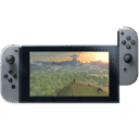
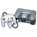
Nintendo’s explanation for the GameChat button on Nintendo Switch 2 reveals how much thought can go into what looks like a tiny detail. On the surface, the final result seems almost surprisingly plain. It is simply a C button, placed below the Home button on the right Joy-Con 2 and reflected on the Nintendo Switch 2 Pro Controller. Yet that simplicity did not happen by accident. It came after Nintendo explored multiple icon ideas, tested prototypes, and weighed how the button would feel, look, and function as part of the wider system.
What stands out most is that Nintendo did not treat the button as a label alone. The team wanted it to connect naturally with words tied to speech and interaction, including chat, communication, and conversation. At the same time, the button had to be easy for players to recognize, easy to refer to in everyday use, and visually consistent with the existing controller language shaped by the A and B buttons. That balancing act is a classic Nintendo move. The company often tries to make new ideas feel obvious only after a long stretch of testing and refinement.
This also shows how Nintendo approaches UI and UX as one connected experience rather than two separate tasks. The icon on the button, the position under the thumb, the relationship to the Home button, and the way players start GameChat all had to work together. In other words, the design was not about creating something flashy. It was about making a new feature feel natural the first time someone picks up the controller. That is the heart of why the final choice matters. The C button is small, but it carries a big job: it introduces a new social feature in a way that feels immediate, readable, and familiar.
Nintendo’s GameChat button design process
When Nintendo adds a new physical button to a controller, it is never just a matter of squeezing one more input onto the shell and calling it a day. The GameChat button on Nintendo Switch 2 is a perfect example of that mindset. Nintendo recently shared that the company explored many different ideas for the icon before settling on the final design, and that alone says a lot. A button tied to a built-in communication feature has to do more than function correctly. It has to make sense the instant you see it. That is a tough assignment, especially on a controller where every symbol, every placement choice, and every millimeter matters. In the end, Nintendo chose a simple C and positioned it just below the Home button, but the road to that point involved repeated prototyping, discussion, and real-world evaluation.
Why the C button mattered from the start
The reason this decision matters is simple: GameChat is not a hidden menu option buried three layers deep. It is a core Nintendo Switch 2 feature designed to be used quickly while playing. That means the button linked to it had to feel like part of the system from day one. Nintendo has already described the C Button as the shortcut that lets players instantly access GameChat, which makes the symbol on that button far more important than it might first appear. If the mark looked confusing, too abstract, or disconnected from the feature, the whole experience would become less smooth. Nobody wants to stare at their controller and wonder what a mystery symbol is supposed to do, especially in the middle of a multiplayer session. The icon needed to invite use rather than create hesitation.
The challenge of making a new button instantly understandable
Adding a new input to a controller that already has a familiar language is a delicate balancing act. The A and B buttons are iconic. The Home button is already visually and functionally established. So how do you introduce something new without making the controller feel cluttered or awkward? That was one of the clear challenges Nintendo faced here. The GameChat button could not look like a stray idea taped onto an otherwise finished design. It had to feel native to the hardware. That means readability mattered, but so did rhythm. The controller has a visual flow, and any new addition needs to fit that pattern. A flashy or overly detailed icon might have stood out in the wrong way. The final C avoids that problem by being readable, familiar, and easy to describe in everyday speech.
How speech and communication shaped the icon concept
One of the most revealing parts of Nintendo’s explanation is that the team wanted the icon to connect with words associated with speech, including chat, communication, and conversation. That choice tells us the company was not only thinking about visual design, but also verbal language. In other words, the button had to work when players talked about it out loud. That is smarter than it sounds. If someone says, “Press C,” that is immediate. It is short, natural, and memorable. A more abstract icon might have looked stylish for five seconds and then become a headache forever after. Nintendo clearly wanted a symbol that players, parents, friends, and support teams could all refer to without friction. That kind of clarity may seem small, but it often decides whether a feature becomes part of daily play or gets ignored like a dusty exercise bike in the corner.
Why Nintendo tested many prototypes before choosing the final mark
Nintendo said it created many prototypes and refined them while actually seeing and touching them, and that detail is important. Design choices often look neat in a flat mockup, but controllers live in hands, not on whiteboards. A symbol can feel perfect on a screen and still fail once it is printed on a small plastic button beside other established controls. By working through multiple prototypes, Nintendo gave itself room to compare legibility, visual harmony, and physical usability. That process likely helped the team answer practical questions. Does the icon still read clearly when the room is dim? Does it visually compete with nearby buttons? Does it feel too decorative compared with the rest of the controller? Prototype work is where assumptions go to either prove themselves or fall apart, and Nintendo’s comments suggest the C survived because it kept solving more problems than it created.
The importance of naming, recognition, and player language
Nintendo also said it wanted players to be able to refer to the button easily. That line deserves real attention because it reaches beyond appearance. A good hardware feature becomes part of player vocabulary. Think about how naturally people say things like Home, Start, L, R, A, or B. Those labels work because they are simple and socially sticky. They travel well from menus to conversations to customer support to schoolyard chatter. The C button seems built with that same goal in mind. It is easy to say, easy to remember, and easy to connect to the feature it launches. That is a huge win for usability. A label that can be spoken naturally reduces friction across the whole experience. It also helps GameChat feel like a proper built-in feature rather than a bolt-on experiment that needs extra explanation every time somebody picks up the controller.
How the C button had to fit the existing controller family
Nintendo explained that the button also needed to harmonize with the already existing A and B buttons. That is one of the clearest clues about why the final design feels so stripped back. The company did not need a miniature speech bubble, a microphone icon, or some futuristic symbol that looked like it came from a router manual. It needed something that belonged next to Nintendo’s existing button language. Letters already carry a long history on game controllers, and the choice of C slides neatly into that tradition. It feels familiar without pretending it has always been there. That is a narrow path to walk. Too plain, and the button risks feeling vague. Too different, and it starts shouting over the rest of the controller. Nintendo landed in the middle, and that middle is often where the smartest hardware design lives.
Why placement below the Home button became the final solution
The final position below the Home button also sounds simple until you think about the alternatives. Button placement affects speed, comfort, memory, and accidental presses. If the GameChat button were farther away, accessing the feature would feel less immediate. If it sat in a more crowded area, it could become annoying or easier to hit by mistake. Nintendo’s description makes it clear that location was part of the broader usability discussion, not an afterthought. The chosen position gives the button a logical home close to system-level functions while keeping it distinct enough to develop its own identity. It also supports the idea that GameChat is a console feature, not something attached only to one game. That small positional choice reinforces the feature’s role every time players look down at the controller and see where C lives.
The role of UI and UX in hardware and software together
One of the strongest takeaways from Nintendo’s comments is the belief that UI and UX are not only about visuals. The company specifically framed the work as connecting software and hardware while considering the overall experience. That is exactly why the GameChat button is more interesting than it first appears. The letter on the button, the menu it opens, the comfort of pressing it, and the ease of understanding it are all part of one chain. Break one link, and the whole thing gets weaker. This is often where Nintendo separates itself from companies that chase novelty first and usability second. The final C button is not trying to impress people with complexity. It is trying to disappear into instinct. You see it, you understand it, you press it, and the feature opens. That kind of smoothness is hard work wearing a very calm face.
How comfort under the thumb influenced the final design
Nintendo also pointed out that even the small C button that fits under the thumb went through many discussions and prototypes, each aimed at creating a comfortable experience. That line brings the whole process back to the hand, where controller design either succeeds or stumbles. A feature can sound great in a meeting room, but if reaching the button feels awkward or unnatural, players will notice immediately. Comfort is not just about softness or shape. It is about thumb travel, confidence, and muscle memory. The C button needed to be accessible without becoming intrusive. It had to feel present but not bothersome. That is a subtle target, like tuning a guitar string until it stops sounding sharp without going flat. Nintendo’s emphasis on repeated prototype work suggests the company kept tightening that tuning until the interaction felt right.
What the final C button says about Nintendo’s design philosophy
The finished design says a lot about how Nintendo thinks. Rather than overcomplicating the solution, the company chose a mark that is plain, functional, and closely tied to the language around the feature itself. That may not sound dramatic, but it is often how strong hardware decisions look in hindsight. They seem obvious only because the messy alternatives were filtered out long before players ever saw them. Nintendo’s process here reflects a philosophy built on reduction. Strip away what is unnecessary, keep what reads clearly, and make sure the final interaction feels natural in motion rather than just attractive in a presentation slide. The result is a button that supports GameChat without demanding attention every second. It is there when you need it, and that restraint may be the smartest thing about it.
Why this small detail could shape how players use Switch 2 features
It is easy to dismiss a single letter on a controller as a tiny detail, but tiny details often decide whether a feature becomes part of everyday behavior. The GameChat button is likely to shape first impressions of how social features work on Nintendo Switch 2. If players can understand and use it immediately, GameChat feels welcoming. If they hesitate, that first layer of friction can quietly push the feature into the background. The C button is Nintendo’s attempt to remove that hesitation before it starts. By tying the icon to familiar communication words, aligning it with the existing button family, and placing it where it feels like a natural part of the system, the company has tried to make GameChat approachable from the first touch. That is the real story here. The button is small, but the thinking behind it is anything but small.
Conclusion
Nintendo’s explanation of the Switch 2 GameChat button shows how much care can sit inside one short letter. The final C button was not chosen because it looked trendy or because it needed to stand out for the sake of it. It was chosen because it connected naturally to chat, communication, and conversation, because it was easy for players to identify and talk about, and because it fit the broader visual language of the controller. Add in the practical placement below the Home button and the attention given to thumb comfort, and the full picture becomes clear. Nintendo was building a shortcut that had to feel obvious, familiar, and pleasant to use. That is what makes the final design land so well. It turns a new console feature into something that already feels like it belongs.
FAQs
- Why did Nintendo choose the letter C for the GameChat button?
- Nintendo said the icon needed to connect naturally to words associated with speech, including chat, communication, and conversation. The letter C also made the button easy to refer to in everyday use.
- Did Nintendo test other GameChat button designs before the final version?
- Yes. Nintendo explained that it created many prototypes and refined them while seeing and touching them in practice before deciding on the final C button design.
- Where is the C button placed on Nintendo Switch 2 controllers?
- Nintendo said the final C button was placed just below the Home button. It appears on the right Joy-Con 2 and is also part of the Nintendo Switch 2 Pro Controller layout.
- Why was button harmony important for the final design?
- Nintendo wanted the new button to feel like a natural part of the controller rather than an odd extra addition. That is why the company considered how it would visually sit alongside the existing A and B buttons.
- What does this reveal about Nintendo’s approach to UI and UX?
- It shows that Nintendo treats UI and UX as more than visuals alone. The company looks at how software and hardware connect, how a feature feels under the thumb, and how easily players can understand and use it in real play.
Sources
- Ask the Developer Vol. 17: GameChat – Part 1, Nintendo, April 3, 2025
- Nintendo Switch 2 launches 5th June, bringing new forms of game communication to life, Nintendo, April 3, 2025
- GameChat Guide and FAQ, Nintendo Support, accessed March 18, 2026