Summary:
Nintendo’s Switch 2 lands with a game-case redesign that looks familiar at first glance yet instantly stands out the moment you crack it open. The outer shell retains the palm-sized footprint we already know, ensuring every new purchase slides neatly beside your original Switch library. Flip the hinge, however, and you’re met with a vivid red interior that feels equal parts playful and provocative. What prompted the change? Does it hint at greener materials or cost-saving shortcuts? And, most importantly, how will collectors, retailers, and everyday players feel about losing that inner cover art many of us loved? In the next few thousand words we explore the practical, aesthetic, and emotional layers of Nintendo’s latest plastic shell—from shelf symmetry to eco-impact, from durability tests to storage hacks—so you can decide whether this crimson casing is a masterpiece or a missed opportunity.
Nintendo Switch 2 Game Cases
Nintendo has never treated packaging as an after-thought. From the chunky NES sleeves to the sleek Switch clamshells, the company’s boxes tell a visual story about each generation’s personality. With Switch 2, the narrative continues—yet this time the headline isn’t a new shape but a daring color swap. That subtle pivot speaks volumes. It signals continuity for cartridge compatibility while broadcasting a fresher, more energetic look. Think of it as renovating a classic home: the blueprint remains, but a splash of fire-engine red on the walls changes the vibe the moment you step inside. Before diving into specs and storage tips, let’s trace how we reached this point and why Nintendo’s design team resisted the temptation to reinvent the wheel—or, in this case, the rectangle.
Same Size, New Splash of Color
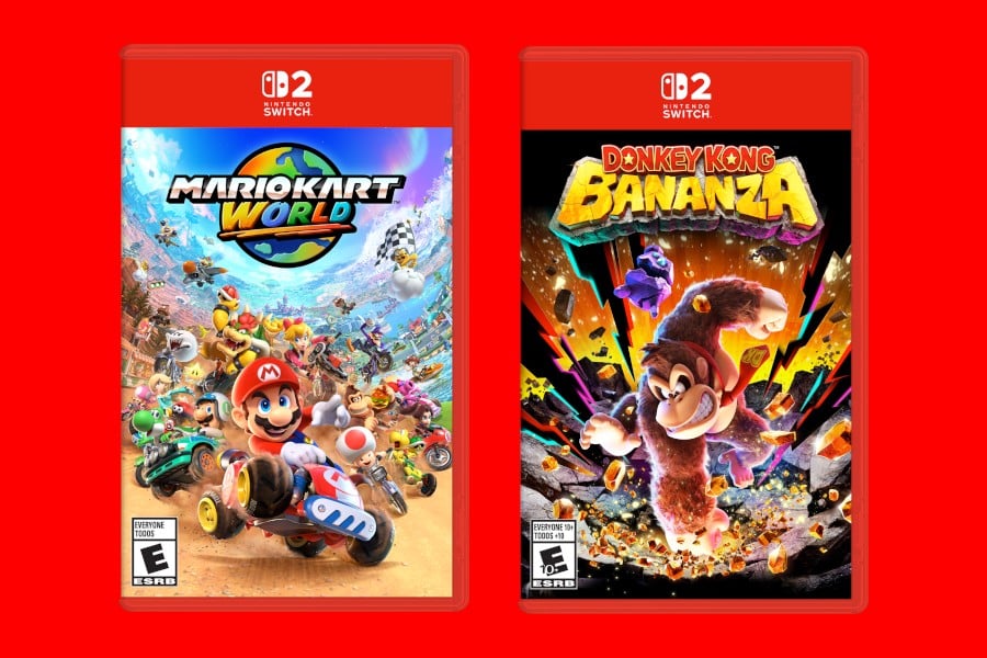
Hold a Switch 2 box beside its predecessor and you’ll play a quick game of spot-the-difference. Spoiler: the outline matches down to the millimeter. That decision keeps production lines humming and ensures third-party accessory makers don’t scramble to retool. Yet the immediate visual cue—candy-red plastic—turns the ordinary into something that practically shouts from a retail shelf. It’s the sartorial equivalent of swapping a black tuxedo jacket for a crimson blazer: same cut, bolder statement. The move also aligns the packaging’s palette with Nintendo’s signature Joy-Con red, creating a cohesive brand language across hardware and software alike.
Why Maintain the Dimensions?
Shrinking the case might have saved plastic; enlarging it could have squeezed in manuals. Nintendo chose stability instead, and there are solid logistical reasons. Warehouses worldwide are already racked for the current footprint, and millions of collectors own shelving units tailored for Switch spines. Changing the size would spark a ripple effect—from print-house die-cuts to point-of-sale displays—that costs far more than the marketing thrill of “new and improved.” Stability also honors backward compatibility rumors—if legacy cartridges slot neatly into a Switch 2 dock, it feels poetic that their boxes do the same on your bookshelf.
Collector Shelf Harmony
Ever lined up a row of game cases only to notice one rogue title standing taller or shorter? It’s a pet peeve for collectors, and Nintendo clearly listened. By locking the dimensions, Switch 2 guarantees a clean, uniform skyline across your shelf. The result is an Instagram-ready display that keeps completionists at peace and makes alphabetizing your library feel like a zen exercise instead of a geometry lesson.
Inside the Crimson Shell
Open the new case and the first thing you notice—aside from the red—is how everything looks comfortably familiar. The game card clicks into its lower cradle with that satisfying “snap” we know so well. Above it, the molded prongs hint at a space once reserved for instruction booklets—now mostly a nostalgic memory in the industry’s digital age. Still, Nintendo hasn’t entirely abandoned tactile extras: the hinge feels firmer, resisting the limp flop that plagued a few early Switch runs. The plastic’s sheen is slightly matte, toning down finger smudges while amplifying the red’s depth under store lighting.
Red Plastic and the End of Inner Art?
That striking color choice comes at a price—literally blocking the view of reversible cover art many fans adore. Nintendo argues that the uniform hue strengthens brand identity; critics counter that it sacrifices a creative bonus that made opening each case feel like peeling back gift wrap. It’s a debate between marketing utility and artistic flair. Could Nintendo compromise by printing art directly onto the plastic? Only time—and fan feedback—will tell.
Design Philosophy Explained
Color psychology plays a subtle role here. Red evokes excitement, urgency, and passion—all emotions Nintendo wants associated with its next-gen launch titles. The design team reportedly tested over a dozen shades before landing on this specific tone, balancing vibrancy against readability of logos and ratings printed on clear sleeves. Think of it like choosing a lipstick shade: too dark and the details disappear; too light and the impact fizzles.
Material Quality and Durability
A game case doesn’t have to survive a ten-story drop, but it does need to endure years of slides, snaps, and accidental carpet crashes. Early hands-on reports suggest the Switch 2 shell uses a slightly denser polypropylene blend, lending extra rigidity at hinge points. Stack five full cases, press down, and you’ll feel less give compared to the older model. That stiffness bodes well for globetrotting fans who toss cartridges into backpacks or foam-padded carrying cases, where flex can lead to cracked spines and chipped corners.
Environmental Footprint of Red Plastics
Coloring plastic isn’t merely an aesthetic decision—it changes recycling logistics. Pigmented polymers can require additional sorting steps, and red dyes sometimes contain cadmium-based pigments that recyclers frown upon. Nintendo claims its dye adheres to RoHS and REACH standards, while pilot programs in Japan collect retired cases for closed-loop recycling into Switch 2 kiosks. It’s a welcome initiative, yet skeptics note that post-consumer collection rates for small plastics remain low worldwide. In other words, the best sustainability move might still be buying fewer physical boxes or trading them locally.
Recycling Challenges
The moment colorant enters the resin mix, recyclers face “downcycling,” where vibrant plastics blend into dull gray feedstock. Nintendo’s solution is transparent: use mono-material construction so cases can be shredded and pelletized without fiddly multi-layer labels. The clear outer sleeve remains a separate film, but it peels off with minimal effort, easing mechanical separation.
Potential Bioplastic Alternatives
Industry watchers speculate that future production runs could pivot to bio-based PLA blends, similar to coffee-cup lids. However, PLA softens at lower temperatures, raising concerns about warping in warm retail warehouses or sunny car rides home. Until additive science evolves, Nintendo’s conservative choice—robust petro-based plastics—remains the safest bet for game preservation.
Retail Presence and Branding
Imagine walking into a store where colorful Switch 2 cases form a red river across end-cap displays. The unified hue transforms each shelf into an instant billboard, saving retailers the trouble of fancy signage. With shrink-wrapped games already competing for shopper attention against towering PS5 blue and Xbox green spines, Nintendo’s monochrome red slices through visual clutter like a stop sign on a busy highway.
User Experience: Opening, Closing, and Cartridge Fit
Slide your thumb into the side groove, lift, and listen for that tiny pop. The latch resistance feels tuned—neither nail-breaking stiff nor floppy. Nintendo appears to have adjusted hinge spring tension, shaving a split second off case-opening time. Is that measurable? Absolutely not. But muscle memory notices. The cartridge cradle remains unchanged, so your instinctive “click-tilt-release” motion to remove a game card won’t need retraining.
Accessory Compatibility and Storage Solutions
From wall-mounted display racks to zip-up cartridge wallets, accessory makers breathed a collective sigh of relief when dimensions leaked. No supply-chain scramble; no outdated stockpiles. That stability extends to shipping boxes and warehouse pallets, limiting waste as old and new inventory coexist. If you already own a Switch-branded tower stand, the Switch 2 cases will slot in with millimeter precision—though that fresh red line might tempt you to rearrange the whole color gradient for visual drama.
What This Means for Collectors
Collectors live for subtle variants—misprints, limited editions, holographic covers. The color shift adds a new chapter to that hunt. Expect early-print Switch 2 boxes with factory codes ending in “A” to become minor grails decades down the road, just as first-run SNES clamshells fetch a premium today. Meanwhile, the loss of inner art nudges some collectors toward importing Japanese releases, historically more likely to include reversible sleeves.
Future Trends in Physical Game Packaging
Will discs and cartridges survive a world racing toward cloud libraries? Probably, but in smaller volumes. Nintendo’s choice to refine—not replace—its physical case hints at a measured road map: keep tactile media alive for regions with patchy internet and for fans who equate ownership with something you can hold. Expect incremental tweaks—QR-code inserts for digital manuals, experimental biodegradable plastics in limited runs—before any radical overhaul arrives. Until then, the trusty clamshell lives on, redder than ever and ready to guard your next kart race, galactic quest, or cozy ranch sim.
Conclusion
Nintendo’s Switch 2 case redesign stays safe where it matters—size and functionality—while flexing just enough flair to feel fresh. That crimson interior sparks conversation, the familiar silhouette calms collectors, and durability tweaks address a few old-generation gripes. Whether you mourn the missing inner art or celebrate the shelves of unified red, one truth stands out: Nintendo remains masterful at blending nostalgia with novelty. The game inside may steal the spotlight, but the box will still earn its moment in your unboxing ritual.
Frequently Asked Questions
- Will Switch 2 cartridges fit in original Switch cases?
- No—each case’s card cradle is molded for its specific card type, so mixing is ill-advised even if the exterior size matches.
- Can I still find reversible cover art in any Switch 2 releases?
- Early reports suggest first-party games won’t include it, but some third-party publishers may offer limited editions with inserts.
- Is the red plastic more prone to fading?
- Nintendo’s dye includes UV inhibitors comparable to previous clear cases, so normal indoor exposure shouldn’t cause noticeable fade for many years.
- Do existing vertical display stands work with the new cases?
- Yes—the footprint is identical, so any stand designed for Switch cases will fit Switch 2 without modification.
- Are the new cases recyclable?
- They’re made from recyclable polypropylene. Check local facilities, as acceptance for colored PP varies.
Sources
- Nintendo Switch 2 Physical Game Cases Are The Same Size As Switch Cases, NintendoSoup, May 17 2025
- Here’s A Look At The Size And Inside Of Switch 2 Game Cases, Nintendo Life, May 17 2025
- Nintendo Switch 2 Physical Game Cases Showcased in New Images, GamingBolt, May 20 2025


