


Former Nintendo of America president, Reggie Fils-Aime, has revealed that Nintendo’s iconic logo was nearly changed for something different.
The reason?
Well the current logo was thought of as perhaps too childish and the marketing team thought they would give it a make over. Thankfully this never ended up happening and Reggie saved the day once again
Reggie
From a branding standpoint, we had to be clear in what Nintendo as a brand stood for, as well as what the individual franchises stood for.
When I joined Nintendo, there was a sense of almost shame that Nintendo appealed to young consumers, and the marketing team at Nintendo of America started doing things with the logo – that classic Nintendo logo in an oval – they would put it into graffiti style, or they’d do different things to try and age up the logo, and I put a stop to that because that is not our brand.
And what we needed to do was yes, appeal to a broad swatch of consumers, but we needed to do it based on what the brand stood for, and not doing it in some false way.
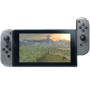
Systemically, we went through and cleaned up the presentation of the brand, but we also created messaging coupled with content that really broadened the reach, broadened the appeal, and set the stage for all of the great products we would launch like Wii, like Wii Fit, and eventually the Nintendo Switch.
Because logo’s matter
Remember back in the late ’90s when the then WWF changed their old block logo to the scratch logo?
According to Reggie, Nintendo almost did the exact same thing! They would have changed the iconic logo you see above into a more graffiti-looking brand.